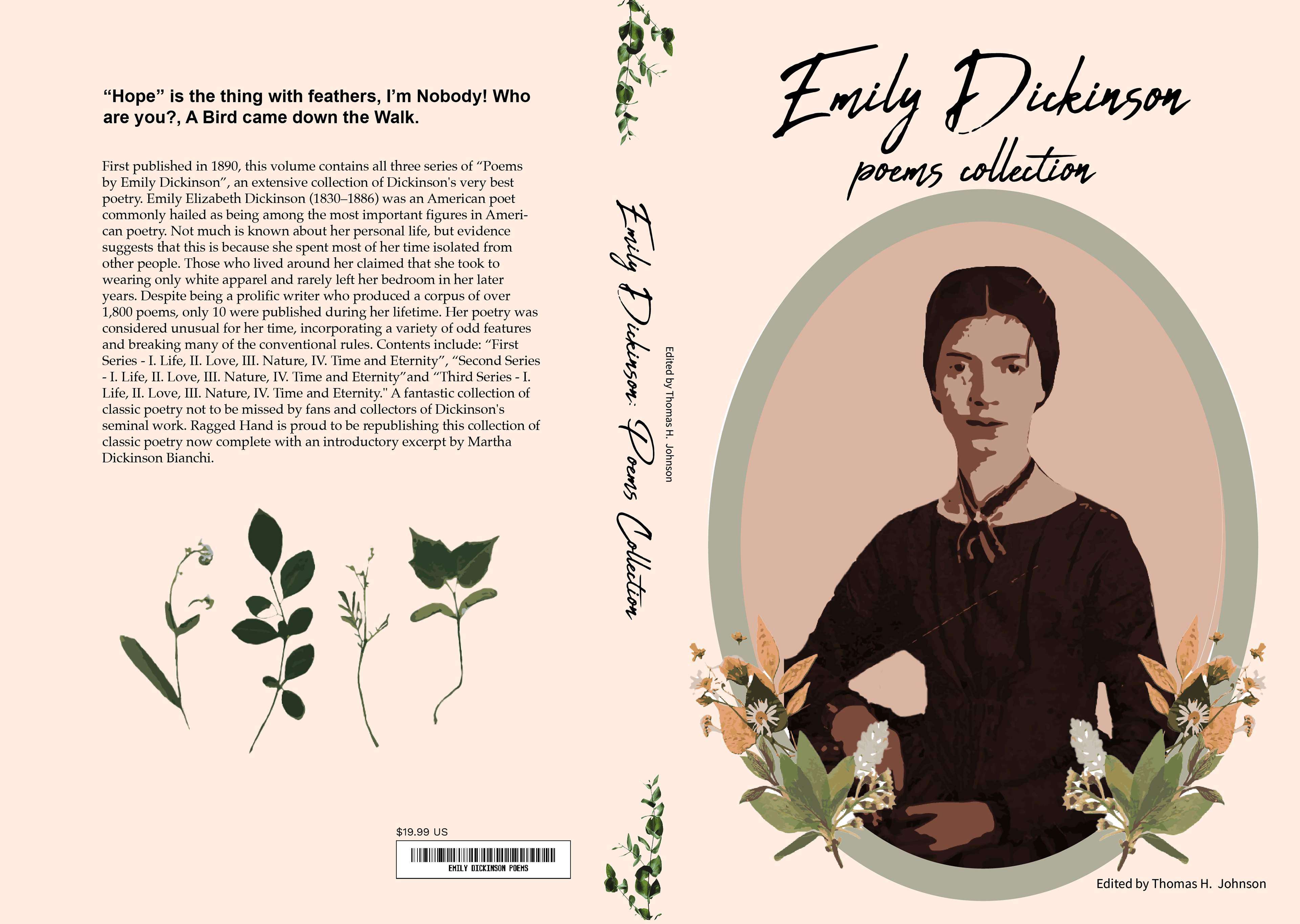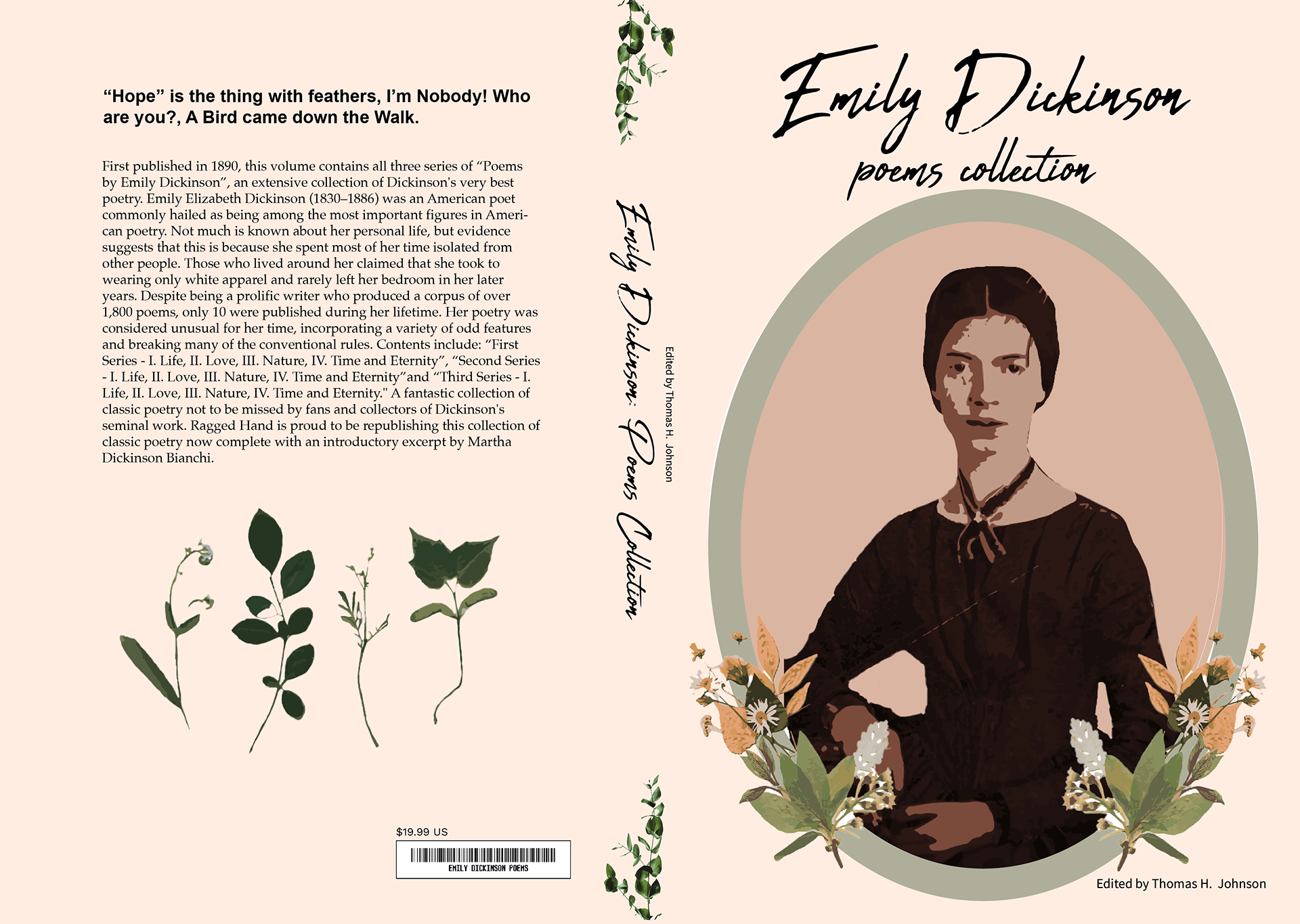
The process of creating a book cover
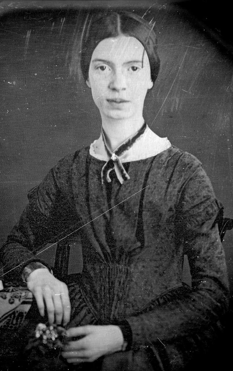
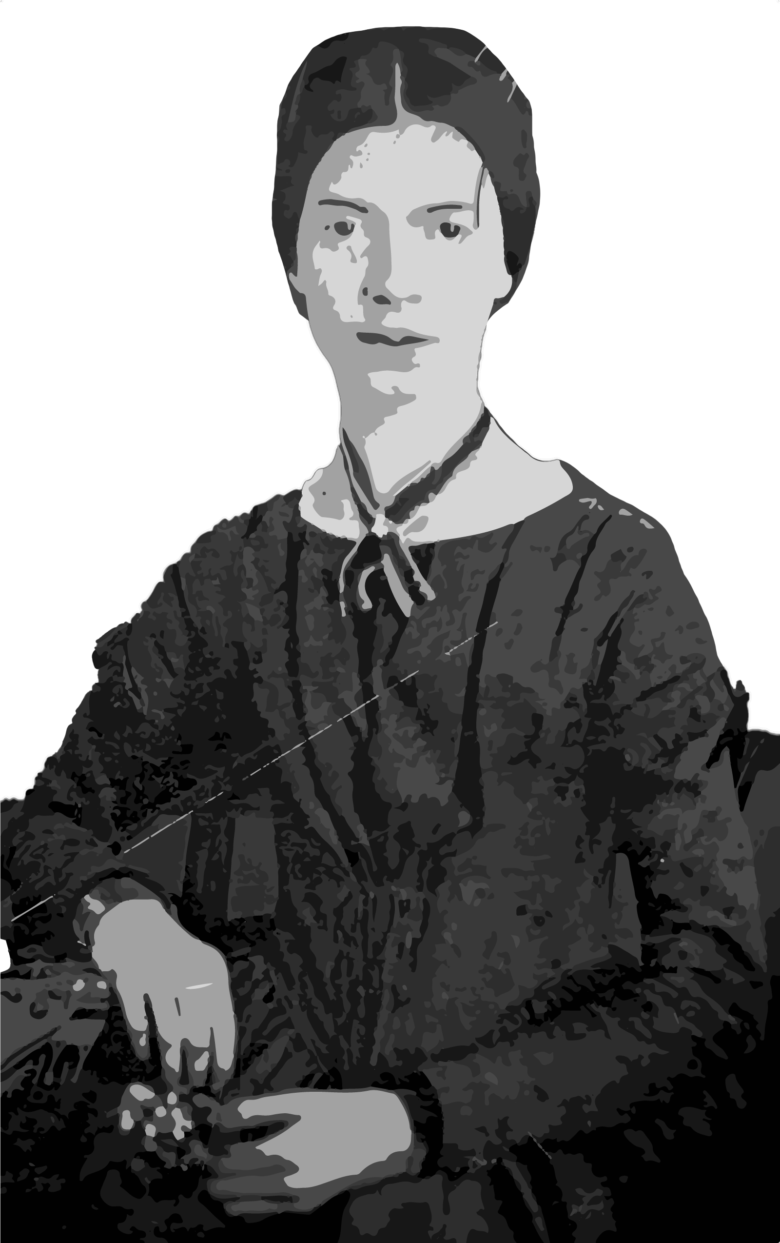
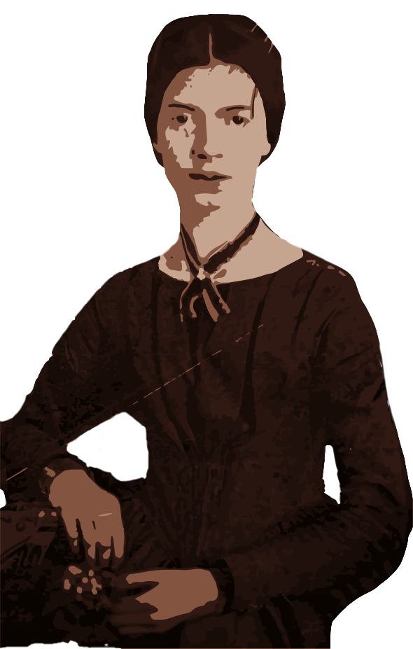
First I found a picture I had liked of Emily Dickinson. As there are very few, this one seemed elegant in this manner for a poet to be featured on the cover of her own book. Once I found the picture I liked, I masked her out of her background and refined the edges of her. Next, she was color corrected for a more vintage feel and flattened colors almost like the flowers she presses. A flat but vintage feel for this style of poetry book seemed the best way to go.
A tribute to Emily's herbarium


Finding images of the delicate leaves she has pressed is a nice fitting to the book cover as they bring elegance. I brought these images into Photoshop and masked them out, then brought them back into Illustrator, putting only a few colors to give them that flattened feel to them in which they would be pressed and remain consistent with the flattened image of Emily Dickinson herself.
From assets to a cover start
Once I had the dimensions of the book created in Adobe Illustrator and the bleed set as well as placement for the spine, I began bringing in elements I needed such as book title and synopsis of the book. I used a vintage color scheme for the book as Dickinson is a poet in the 1800's. I created a oval frame to put Emily in as it felt more of a frame for a portrait. She loved to press flowers and or leaves as well as writing poetry, so I was sure to include that in the cover itself which also tie in with how I curated the picture of Dickinson herself.
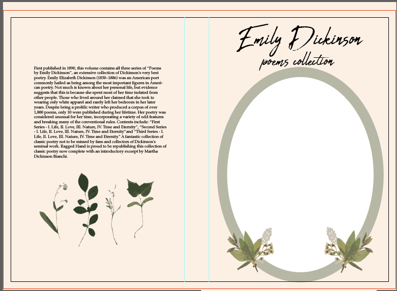
A finished book cover featuring Emily Dickinson's poems